§ Proof · 2026 · Brand identity · Visual system
Trivium Partners.
Nashville's most competitive recruiting market. No brand. No equity. No room for polite.
See it live ↗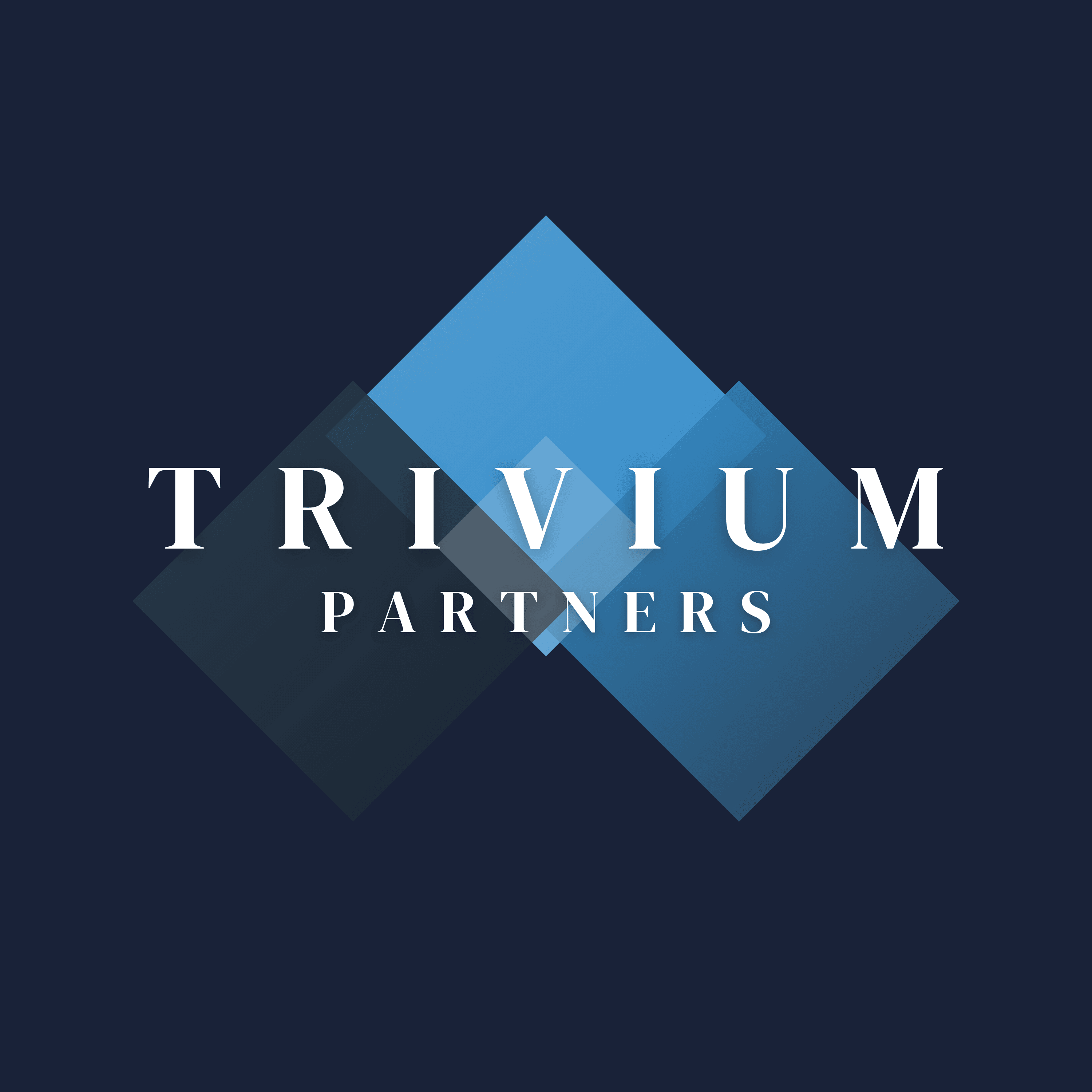
§ The Problem
Trivium Partners walked into one of Nashville's most competitive recruiting markets with nothing. No brand. No identity. No reason for anyone to take the meeting.
In recruiting, the brand is the pitch. Nobody signs with a staffing agency that looks like a side project with a Canva logo and a palette picked by committee.
§ The Work
We started with the name. Trivium: three ways, in Latin. Job seekers, employers, results. The whole identity is built on that tension and never apologizes for it.
Logo, color, type, the entire visual system. Built from scratch to say established before they’d placed a single hire.
The site is by our sister studio, unweby. Same point of view. Zero boring.
site by unweby ↗§ The Verdict
“We handed them a concept. We launched looking like we’d been around for years. That’s entirely their fault.”
Karen Wells · Founder, Trivium Partners
§ The Result
+110%.
website visits after launch
Trivium launched looking like a firm that had been winning for years. On day one.
Clients came in immediately. The brand closed them before the first call was even booked.
That’s what a real identity does.